


4M+ Oodie Customers Globally | 7M+ Oodie Originals Sold | 8-Figure Annual Revenue Brand | 0 Recurring Revenue Pre-Project |
About The Oodie
The Oodie is one of the world's most recognisable comfort wear brands. With over 4 million customers across the globe and more than 7 million Oodie Originals sold, they have built a cult following on the back of a simple, powerful product: an oversized wearable blanket that people genuinely love. Their catalogue spans hundreds of designs — from classic solids to high-profile licensed collaborations with Pokémon, Harry Potter, Friends, and One Piece — giving customers a near-endless reason to come back.
Despite this, The Oodie operated entirely on a one-time transactional model. Every sale was a fresh acquisition. There was no membership, no loyalty mechanic, no subscription infrastructure — just a straightforward buy-now experience repeated over and over across millions of customers.
For a brand of this size, that represented a significant untapped opportunity.
The Challenge
The Oodie didn't have a product problem. They didn't have a brand problem. What they had was a revenue model that was leaving money on the table.
Their customers were already behaving like members — returning for new collections, buying gifts, picking up seasonal drops. But there was no system capturing that loyalty, rewarding it, or converting it into predictable monthly revenue. Every returning customer was being treated the same as a cold stranger walking in for the first time.
On top of that, the current purchase flow offered only one path: pay full price. For a brand running constant promotions and BOGO offers, this created a ceiling on how well any individual transaction could perform. There was no mechanism to increase spend per visit, no incentive to deepen the relationship between purchase, and no way to build a sustainable retention layer beneath the acquisition engine.
The question Apptics Max was asked to answer: how do you design a membership system that fits naturally into an existing high-volume e-commerce operation — without disrupting what's already working?
The Core Problem | The Oodie had millions of loyal customers and zero infrastructure to monetise that loyalty beyond the next sale. |
The Insight
The foundation of this project wasn't a design brief. It was an observation.
Subscription and membership models workwhen three conditions are met: the customer already loves the brand, the product is inherently re-purchasable, and the membership benefit is immediately felt — not deferred to some future reward. The Oodie ticked every box.
Their customer base is emotionally attached to the product. New designs and licensed drops give people a natural reason to return multiple times a year. And critically, the brand's existing discount mechanics — sales, BOGO offers, seasonal promotions — had already trained customers to expect value. We just needed to formalise that value into a structure that a customer could opt into permanently.
Rather than building a separate loyalty programme that lived outside the purchase journey, we identified that the highest-leverage opportunity was to embed the membership offer directly into the transactional flow. The customer is already in a buying mindset. The savings are already visible and tangible. The friction of joining is at its lowest at exactly the moment a customer is about to hand over their card details.
That became the design principle behind everything that followed: the membership shouldn't feel like a detour. It should feel like the obvious choice.
What We Built: The Oodie Comfort Club
Apptics Max designed the Oodie Comfort Club — a VIP membership programme priced at $59/year, built around the idea that loyal customers deserve a permanently better price. Members get up to 80% off products, a sign-up bonus, 5% cash back on all purchases, exclusive deals, a Cuddle Credits system for accumulating value across purchases, and a refer-and-earn mechanic to drive organic growth.
But the membership itself was only part of what we built. The real work was engineering a complete funnel — every touchpoint a customer encounters from first awareness to completed checkout was redesigned to present, contextualise, and sell the Comfort Club. Here is how each layer was built.
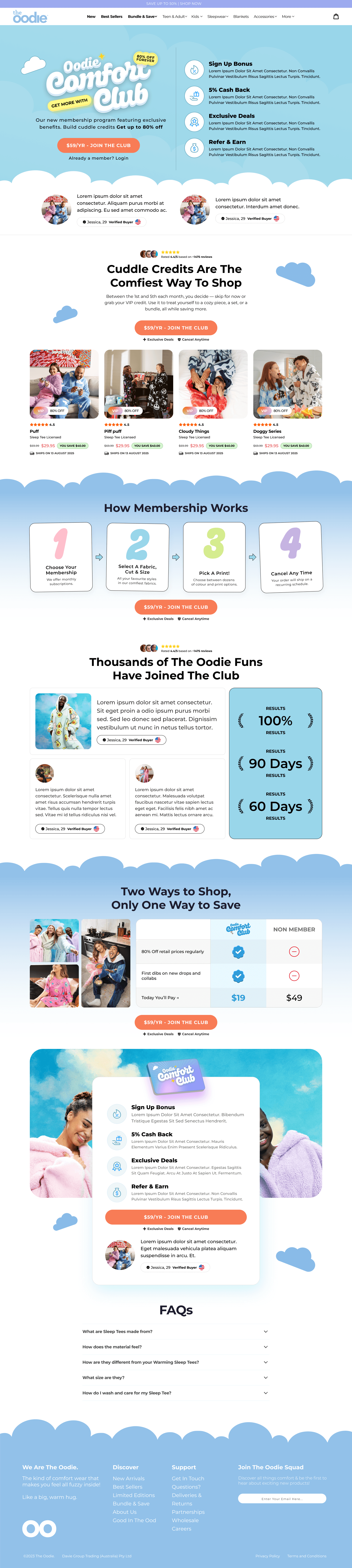
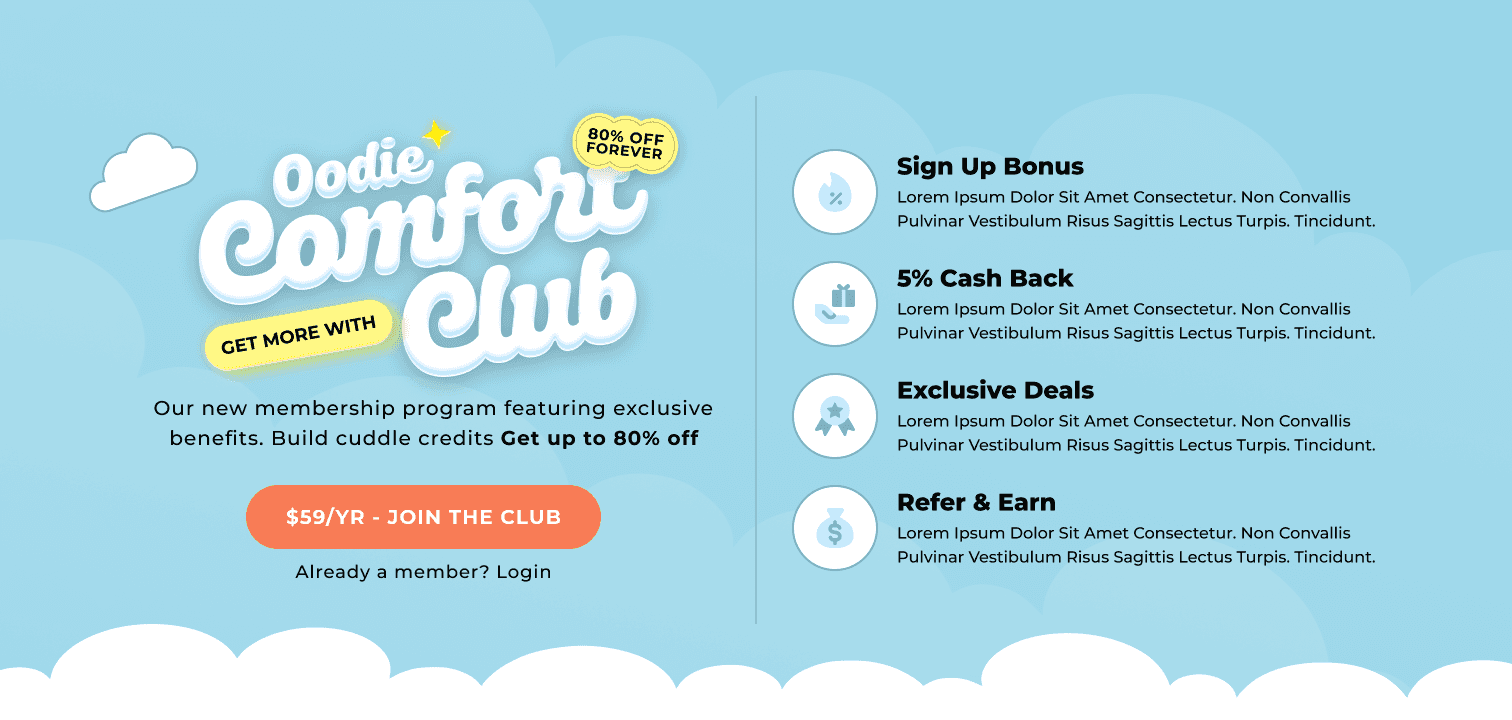
1. The Membership Landing Page
The dedicated Comfort Club landing page acts as the primary destination for direct membership sign-ups and serves as the persuasion anchor for the entire funnel. It was designed for both desktop and mobile and follows a structured conversion framework:
Hero section with the Comfort Club branding, the $59/yr CTA, and a clear benefit summary — Sign Up Bonus, 5% Cash Back, Exclusive Deals, Refer & Earn.
Social proof block pulling from verified customer reviews to establish trust immediately above the fold.
A 'Cuddle Credits Are The Comfiest Way To Shop' section explaining the credit accumulation mechanics with product examples showing member pricing in action.
'How Membership Works' — a four-step visual process (Choose Your Membership, Select Fabric/Cut/Size, Pick a Print, Cancel Any Time) that removes ambiguity and handles the most common objections before they arise.
A member vs. non-member comparison table making the value differential impossible to ignore.
A secondary CTA section and full FAQ block addressing concerns around billing, flexibility, and cancellation.
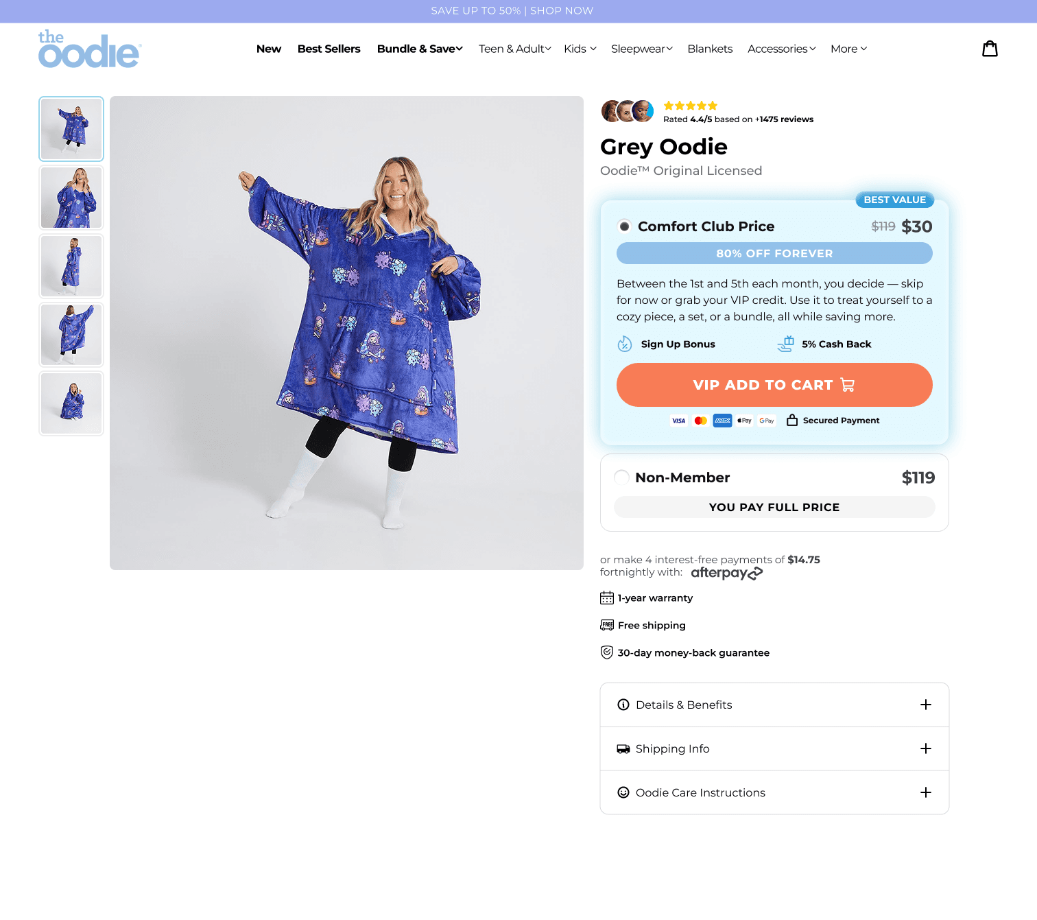
2. The Product Page (PDP) Redesign
This is where the membership model has the greatest immediate impact on conversion. Rather than presenting a single price, the redesigned product page offers two clearly differentiated options side by side:
Comfort Club Price | Labelled 'BEST VALUE' — displays the member price (e.g. $30 vs. $119 full price), '80% OFF FOREVER', and a 'VIP ADD TO CART' button with secured payment icons. |
Non-Member | Displays full retail price with 'YOU PAY FULL PRICE' — and a secondary 'NON-MEMBER ADD TO BAG' button styled in a neutral black. |
The visual hierarchy does the selling. The Comfort Club option is presented first, highlighted in blue, and branded as 'Best Value'. The non-member option sits below it, visually flat and clearly the inferior choice. The price contrast — $30 vs $119 — is stark enough to communicate the value proposition without a single word of copy needing to work hard.
Below the pricing options, the Afterpay instalment breakdown is visible, along with standard trust signals (1-year warranty, free shipping, 30-day money-back guarantee) and a Comfort Club benefit summary so members are reminded of what they're unlocking even at the point of adding to cart.
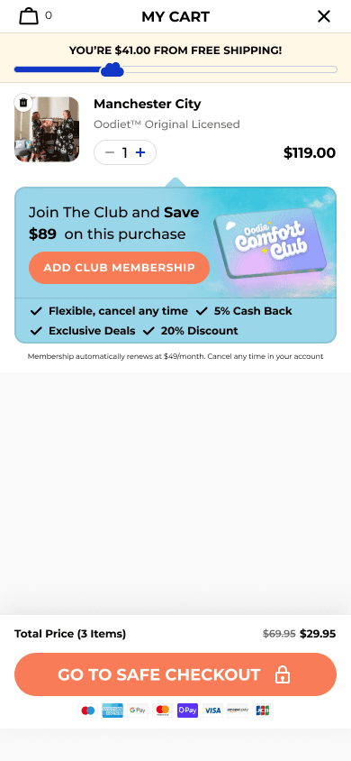
3. The Cart Upsell
For customers who reach the cart without having joined the Comfort Club, a dedicated upsell block appears inside the slide-out cart drawer. The copy leads with the dollar saving specific to the items in the cart ('Join The Club and Save $89 on this purchase'), followed by a prominent 'ADD CLUB MEMBERSHIP+' button and a checklist of four key benefits.
Once a customer accepts, the cart updates in real time: the Comfort Club appears as a line item (14 Days Trial — $0), the product price drops to the member price, and a banner confirms 'THE MEMBERSHIP IS ACTIVE! YOU SAVE $89'. The savings become tangible and visible before they've even reached checkout.
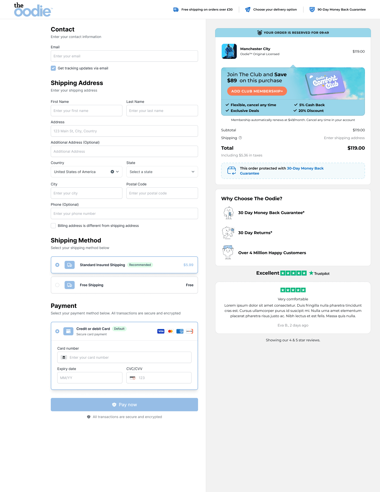
4. The Checkout Experience
The membership context is carried all the way through to checkout. Two states were designed:
With Membership Active: The order summary sidebar shows the product at the discounted member price, with the 'THE MEMBERSHIP IS ACTIVE! YOU SAVE $89' banner running above. This provides ongoing purchase reinforcement — the customer is reminded of the saving they've unlocked right up until they hit pay.
Without Membership: A styled 'Join The Club' upsell block sits in the sidebar above the order summary, giving non-members a final opportunity to activate the saving before completing their purchase.
This means there is no moment in the purchase journey — from product page to payment confirmation — where the Comfort Club is out of sight.
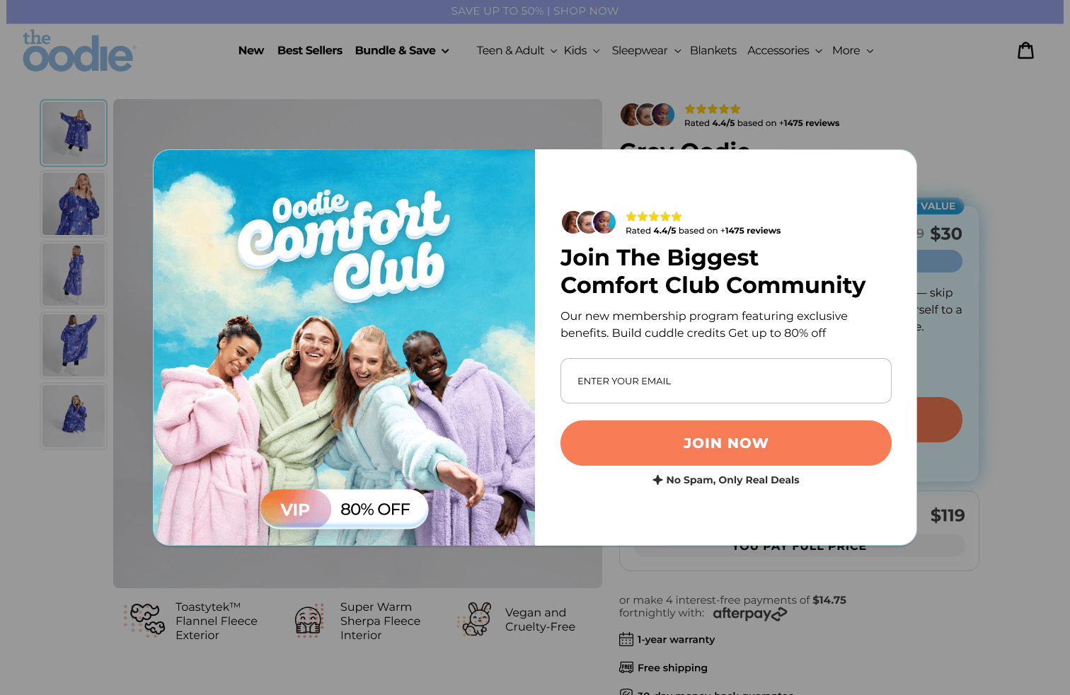
5. The Sign-In Pop-Up
A designed pop-up modal captures membership sign-ups at the browse stage — triggered for visitors who haven't yet joined. The modal uses the Comfort Club hero imagery, a 5-star social proof block (4.4/5 based on 1,475+ reviews), a bold headline ('Join The Biggest Comfort Club Community'), short descriptive copy, an email capture field, and a 'JOIN NOW' CTA. The image carries a 'VIP | 80% OFF' badge to anchor the value proposition immediately.
The bottom of the modal reads: 'No Spam, Only Real Deals' — a small but deliberate trust signal for email-hesitant visitors.
6. In-Merchandise Collection Banners
Comfort Club promotional tiles were designed to sit natively within the product grid on collection pages, so the membership offer appears in the natural flow of browsing — not as an overlay or interruption. The tiles carry the Comfort Club branding and direct browsers to the landing page with a 'JOIN NOW' CTA, meaning acquisition touchpoints exist at every stage: homepage, collection, product, cart, and checkout.
[ IMAGE: In-Merch_Banners.png — Collection page with Comfort Club tiles embedded in product grid ]
[ IMAGE: Frame_2147228241.png — Additional collection banner placement ]
Why This Is Built To Work
The savings are immediate and visible
Most loyalty programmes ask customers to earn their way to a reward over time. The Comfort Club flips this entirely. The saving is visible on the product page before a customer even decides to join — $30 vs $119 — and it's confirmed at every subsequent step. There is no deferred gratification. The value is front-loaded, which dramatically lowers the psychological cost of the $59 annual fee. A customer spending $119 on a single Oodie pays back the annual membership cost and still saves $30 in a single transaction.
The offer is embedded, not bolted on
The Comfort Club doesn't exist as a separate section of the site that a customer has to navigate to. It lives inside the purchase journey — on the PDP, in the cart, at checkout, in the product grid. A customer can complete an entire shopping session without ever leaving the buying flow. This is the critical difference between a loyalty programme that sits alongside commerce and one that is woven into it.
The price contrast does the persuasion work
The dual-option product page design creates an implicit comparison that requires no additional copy to land. Presenting $30 (member) next to $119 (non-member) — with 'BEST VALUE' and '80% OFF FOREVER' — creates the same anchoring effect as a crossed-out RRP on a sale item, but more powerful because the route to accessing that price is a defined, repeatable membership. The customer isn't choosing between buy and don't buy. They're choosing between two ways to buy, and one of them is obviously better.
The 14-day trial removes the final barrier
For customers who are still uncertain, the trial presentation in the cart — 'The Oodie Comfort Club: 14 Days Trial — $0' — removes the last point of resistance. There is no upfront cost at the moment of greatest intent. The customer gets the immediate product discount, experiences the membership, and makes the retention decision after they've already seen the value first-hand.
Every touchpoint reinforces the same message
Pop-up, product page, cart, checkout — the Comfort Club and its core promise (up to 80% off, cancel any time, exclusive deals) is visible at every decision point. This isn't repetition for its own sake. Consistent reinforcement across the funnel builds familiarity, which reduces hesitation, which increases conversion. By the time a customer reaches checkout, the Comfort Club isn't a new idea — it's a natural next step.
Project Scope at a Glance
Deliverable | Details |
Membership Concept & Strategy | VIP Comfort Club model — pricing, benefits, Cuddle Credits, trial mechanic |
Landing Page | Full desktop + mobile design. Hero, benefits, social proof, comparison table, FAQ |
Product Page (PDP) | Dual-option pricing redesign — Comfort Club vs Non-Member, desktop + mobile |
Cart Upsell | Slide-out cart with dynamic membership offer, real-time savings confirmation |
Checkout | Both states designed — member (savings banner) and non-member (upsell block) |
Sign-In Pop-Up | Email capture modal with social proof and VIP hook |
Collection Banners | In-grid promotional tiles for product collection pages |


What’s apptics Max
What types of businesses do you work with?
Can you manage projects end-to-end?
How does your pricing work?
What is your typical project timeline?
Do you offer post-launch support?
How do we get started?


